Relief (& habitable) furniture
Dwelling bigger and better (in happiness)
-from living-room to living-landscape -
- Upsize your apartment
- Diversify your working space
- Transform office into dwelling
- Add a workstation at home
- Increase perspectives and uses
How ?
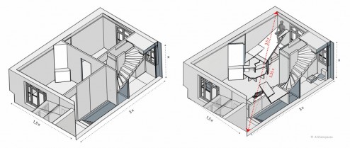
In extending living space through the 3rd dimension with The relief furniture, approved during lockdown: demonstration
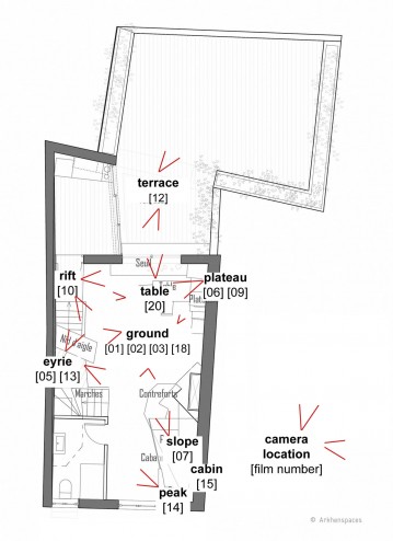
[01] View from the ground (location on map, and more videos at the end of the article )
This is an exemple to improve living space within our flat. First, take into consideration the 3rd dimension, the height to let emerge a wide variety of places, shelters, viewpoints : to extend distances, to reach the ceiling, to open the relief.
To design a multiplicity of atmospheres, nooks and crannies, in order to better cohabit, to set your body into motion, to isolate yourself and to exchange.
This place, this house is also a practical application and experimentation of my architectural research.
Ar(t)chitecture as a way to improve, to extend space and life, to carve souvenirs and increase the potential to satisfy your needs and desires.
[03] View from the ground
(location on map and more video at the end of the article)
/////////////////////////////////////////////////////////////////////////////////////////////
The original text (in french) has been published in Chroniques d’architecture presented during the exhibition Et demain on fait quoi in Pavillon de l’arsenal , Paris and in Culture Art et Psychanalyse .
Lockdown : aspiration to fly « EnVol »
Lockdown: Keeping a living being (animal or plant) in a restricted and closed volume. So where to find space? The answer is partly in the very definition: by better exploiting the “volume”.
This is an opportunity to talk about an architectural concept: EnVol, abbreviation of « En Volume », developed by Arkhenspaces in 2016 and since then regularly deepened and refined.
Let’s finish with the m²
To think in n-spaces (multi-dimensional environments) is to think of all the dimensions of space and first of all, therefore, to think in volume. Architectural thought is expressed through writings and plans. This language is not architecture, it is its score, a representation with its codes, thicknesses, typologies and meaning of lines, etc.
Volume was often expressed through two-dimensional representations: plans, sections, facades. The section is my preference, it shows the space, the volume. That of a museum, a library or any monument speaks in the way that it usually represents an original space.
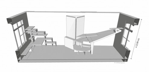
However, the sections of a contemporary building of housing or offices, are very poor : the height under ceiling is always fixed, that is to say that there is no discussion about it. It is an imposed form. There is a defined height for accommodations (2.50m) and another for offices (3 to 3.30m). These values, judged as optimal, become almost immutable: standardization, normalization, poverty and boredom.
The resilience of a system depends on its diversity. A system that is effective in one context may be ineffective in another.
The increase in height is neither a loss nor a free luxury. First, it allows to multiply the layers of air and, well used, becomes an opportunity.
I have always been surprised by the cost/m² ratio. This measurement unconsciously blocks certain research because it implies that a space (let us speak here mainly of housings or offices and put aside the “monuments”) is judged through this unique value. There is a cost per m² and I buy, I rent m²: here is the comparison tool – extremely simplified – put in place to evaluate properties and costs, whether in terms of construction price or selling price. What a pity to simplify our environments in this way!
Dwelling bigger
In other countries, we buy m³, which is already a little better. But in the era of n-spaces, should we not also consider meters to the power of 4, m4 (i.e. m².h) or m5, m6, etc.?
Let’s go back to the passage from m² to m³. I think that this time of “lockdown” invites us to take advantage of each parcel of air. Should we question more the volume ? The new concept of living space called EnVol questions the habitability of our spaces. It can be approached in different ways and can be set up in new buildings as well as in old ones in the form of « relief furniture » or « habitable furniture ». This could be a response to increase the habitability of existing apartments in large cities where the ceiling height is more generous.
“Raw” experimentation in my own habitat: a small house in the center of a medium-sized town.
I was confined there for several weeks and it gives me the opportunity to experience it full time. The result of this intense and daily experience goes beyond my expectations, not in the way I used it (architect, I love space and I take pleasure in experimenting with it in every way) but in the way in which my loved ones, my family confined with me, were able to live it on a daily basis. It is a way of living by being close to one another, by being able, if and when we wish, to remain in our own universe.
The distancing and variation of atmospheres are expressed here through more varied architectural principles than a simple partition. The place also offers new angles of vision, the relationship to the other is modified. This new approach invites us to reconsider height. Claude Parent had already done a lot of research and experimentation in this direction. I tried to pursue it.
The oblique is great because it invites you to sit down, which is what makes the place of the Georges Pompidou center inspired by Siena so lively. It changes our relationships: the shortest can become taller than the tallest, etc. New relationships are then established between the body (his body), space and the other or others. So my daughter can have a height of gaze in the literal sense higher than mine.

From living room to living landscape
This new approach shifts our perceptions and our exchanges. Sitting in the upper corner of a room to read provokes another sensation: like a cat, we dominate the space, while being hidden and relatively inaccessible. The number of heights, whether seated or standing, increases. Each surface accommodates several uses: sitting, crossing or passages, storage, paths, offices: a step serves as a chair, a promontory bench, a stair shelf, a slope for a deckchair, etc. There appears a different relationship or bodily contact (almost carnal) with matter, which suggests postures and puts the body in more motion.


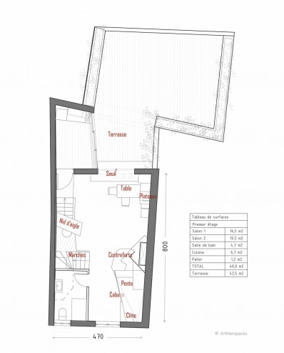
Here is the plan of the space, the ceiling height is 2.90m and there is 29m² of floor space, and yet an interior geography appears with more than ten places (the table, the top , the slope, the cabin, the plateaus, the eyrie, the buttresses, the steps and the threshold), nearly twenty different seats, many accessible heights and very varied atmospheres more or less hidden, more or less perched, etc. . The improved exploitation of the volume multiplies the configurations and the views, the apprehensions, the exchanges.
These practices make it possible to experiment and adjust the work that has been theoretically deployed through the EnVol concept. The benefits are many. They bring back the charm of the attic, improve living together, the biomechanical hygiene of the body and make it possible to live differently in (much) larger and more diverse places with a constant surface area…
I would like to invite you to my place, but it’s not that simple. Here is a series of more than ten « 1-minute videos » in sequence shots made over a long weekend of lockdown. They will enable you, in a playful way, a little like silent films or small theatres, to better understand this research through the different postures, spaces, configurations and possible uses.
Eric Cassar 2020
/////////////////////////////////////////////////////////////////////////////////////////////
Vidéos location

[02] View from the ground
[05] View from the eyrie
[06] View from the high plateau
[07] View from the slope
[09] View from the central plateau
[10] View from the rift
[12] View from the terrace
[13] View from the eyrie
[14] View from the peak
[15] View from the cabin
[18] View from the ground
[20] View from the table
/////////////////////////////////////////////////////////////////////////////////////////////
Design & architecture : Arkhenspaces (2017-2018)
Arkhenspaces team : Eric Cassar, Iker German
Carpenter : Carlos Toro
Video (2020 during lockdown) : Eric Cassar

